The design question
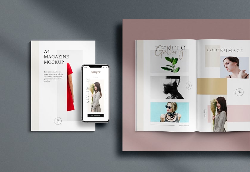
A skincare identity has to communicate a consistent tone across packaging and digital communication. This concept explores a calm editorial direction with soft colour and restrained typography. It is a fictional creative demonstration, not proof of a product formulation, regulatory review or a commercial brand engagement.
Why this direction
Consistency matters more than adding decorative elements to every surface. A production identity would define logo clear space, colour roles, typography and image treatment, then test those choices on labels, website components and campaign layouts. Small packaging text must remain readable in the actual print process and size.
How we would validate it
We would review the identity in monochrome, on a small label, on a phone and against different background colours. Packaging production would need accurate dimensions, printer specifications and approved product information. Ingredient, safety, certification and benefit claims would require validation by the actual product business.
Scope and limitations
The study illustrates a visual system and the questions it raises for production. It does not claim sales, customer research or product efficacy. A real engagement would add a verified brief, rights review and production specifications before final assets were prepared.
Related service: Graphic Design. Read more in our practical guides.