The design question
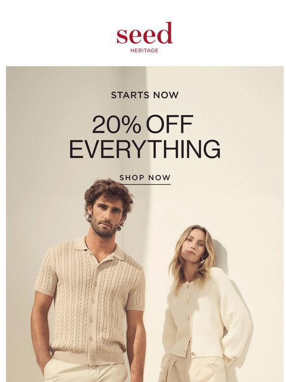
A product promotion can become difficult to scan when offers, images and buttons compete for attention. This email concept explores one primary message and a deliberate reading order for a narrow inbox. The offer and brand are creative examples rather than a real campaign sent to a mailing list.
Why this direction
Reusable content modules would make it easier to vary a headline, product group or supporting detail without rebuilding the whole message. Important offer information should remain readable when images are blocked. A production version would also need accurate sender details, destinations, terms and the sending platform’s required controls.
How we would validate it
We would send a test through the actual email platform and inspect representative inbox clients. Tests would include small-screen wrapping, images-off mode, button destinations and a static animation fallback. A browser preview is useful for layout inspection but cannot demonstrate universal email-client compatibility or inbox delivery.
Scope and limitations
The study presents a visual direction and a testing plan. It does not claim open rates, sales, conversions or a client engagement. Launching a real campaign would require approved content, a permission-based audience, implementation and client-specific testing.
Related service: Email Development. Read more in our practical guides.